The logo editor
Change your logo's icon colors, fonts, slogan, background, layouts, and brand color — free, any time — with a Pro Editor for free-form layouts.
What it is
The logo editor is where you customize a Zoviz logo: every part of it is editable vector art, so you can recolor the icon, change the fonts of the name and slogan, add a background, switch layouts, and set the brand's main color. Nothing is baked in — a logo you picked from the album months ago can be changed today, and your Brand Kit re-renders with the change.
Everything here is free, whether the brand is unlocked or not. Downloading the finished files in full quality still needs an unlocked brand.
Where to find it
| Surface | Where |
|---|---|
| The album | Open a concept and choose Customize first — it opens in the editor |
| Brand Dashboard | Edit logo — reopen the editor for your current logo any time |
The screen
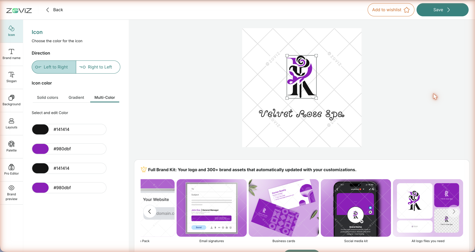
- Top bar: Back (asks Discard Changes? if you've edited anything — choose Discard or Keep Editing), Add to wishlist, and Save.
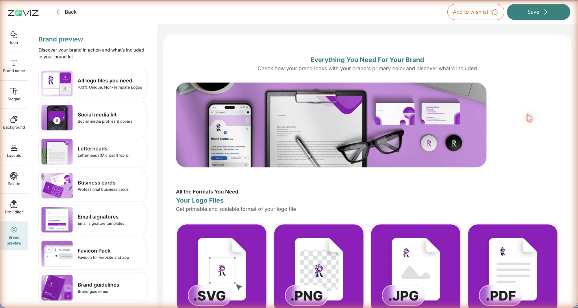
- Left rail: eight panels — Icon, Brand name, Slogan, Background, Layouts, Palette, Pro Editor, Brand preview. Each is explained below.
- Canvas: your logo; in the Icon and Brand name panels, handles mark the element you're editing.
- Full Brand Kit strip (below the canvas): a carousel of your brand assets — logo files, social media kit, business cards, email signatures, favicon pack, letterheads, brand guidelines — updated with your customizations, plus a Get It Now button for the brand kit itself.
Icon
- Direction — Left to Right or Right to Left: which side of the name the icon sits on (you'll see it in the horizontal layouts).
- Icon color, in three tabs:
- Solid colors — a color picker with an eyedropper, a hex field and a hue slider, plus quick swatches: Logo colors (the colors already in your logo) and Recent colors.
- Gradient — your Custom gradients (add one with +), your logo colors, and a grid of gradient Suggestions.
- Multi-Color — for icons drawn in more than one color: each colored part of the icon is listed with its hex value (a two-color icon can show more than two rows); click a row to open a picker for that part.
Brand name
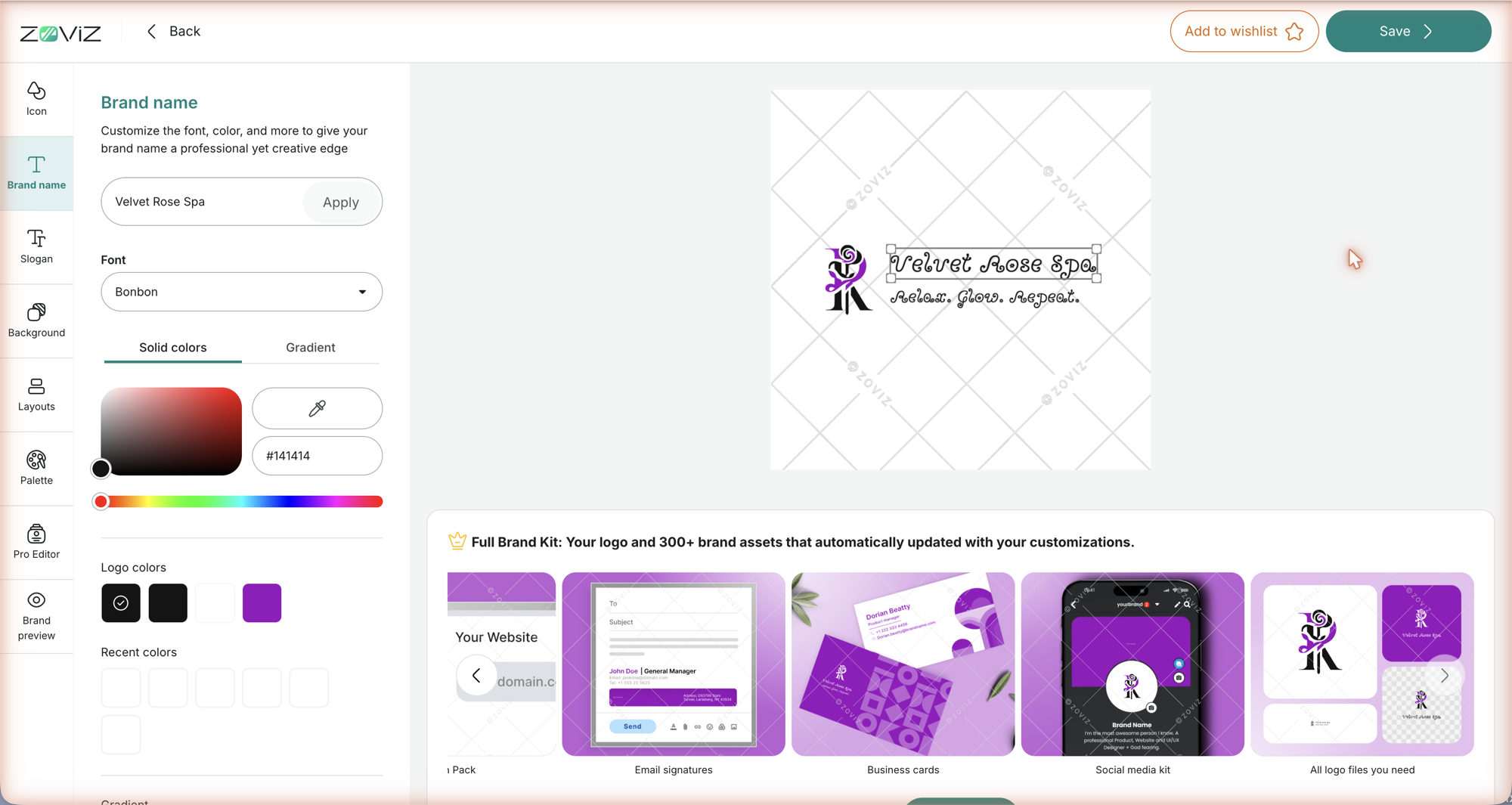
Type a new name in the field and press Apply to see it on the logo. Then pick a Font — the dropdown has a search box and a Load more button — and color it with the same Solid colors / Gradient tools as the icon.
Slogan
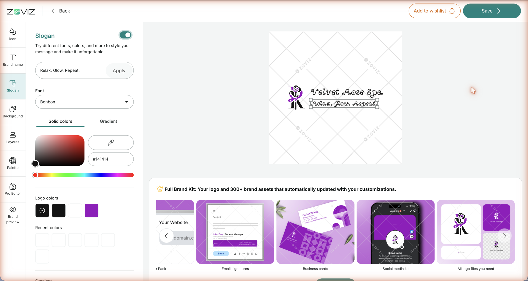
The Slogan panel starts with a switch. Turn it on, type your tagline and press Apply; the slogan appears under the name and gets its own Font and Solid colors / Gradient controls. Turn the switch off to hide the slogan; switch it back on and your text is still there.
Background
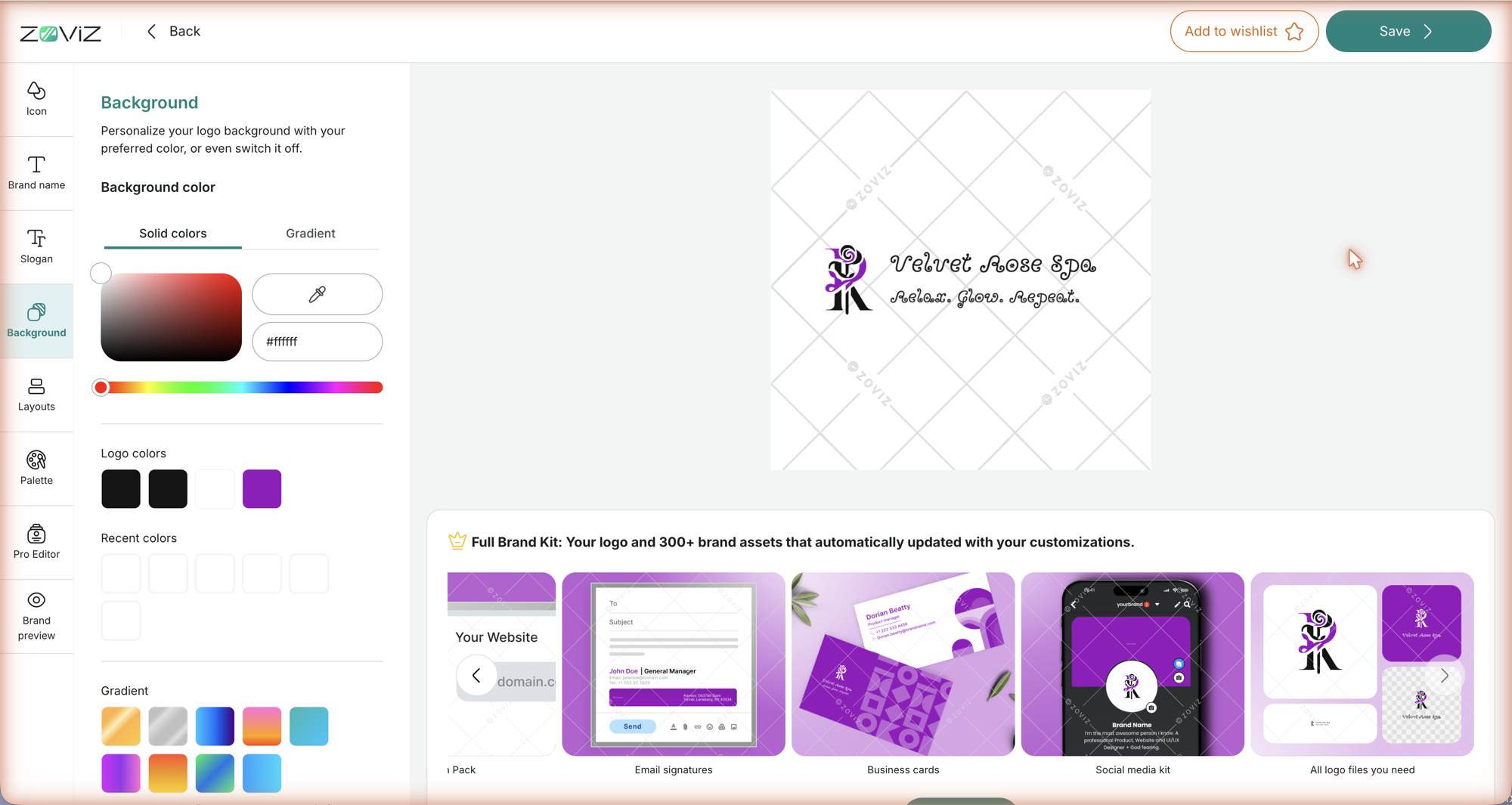
A color behind the whole logo — Solid colors or Gradient, with the same picker and swatches. If you don't set one, the logo sits on white (#ffffff).
Layouts
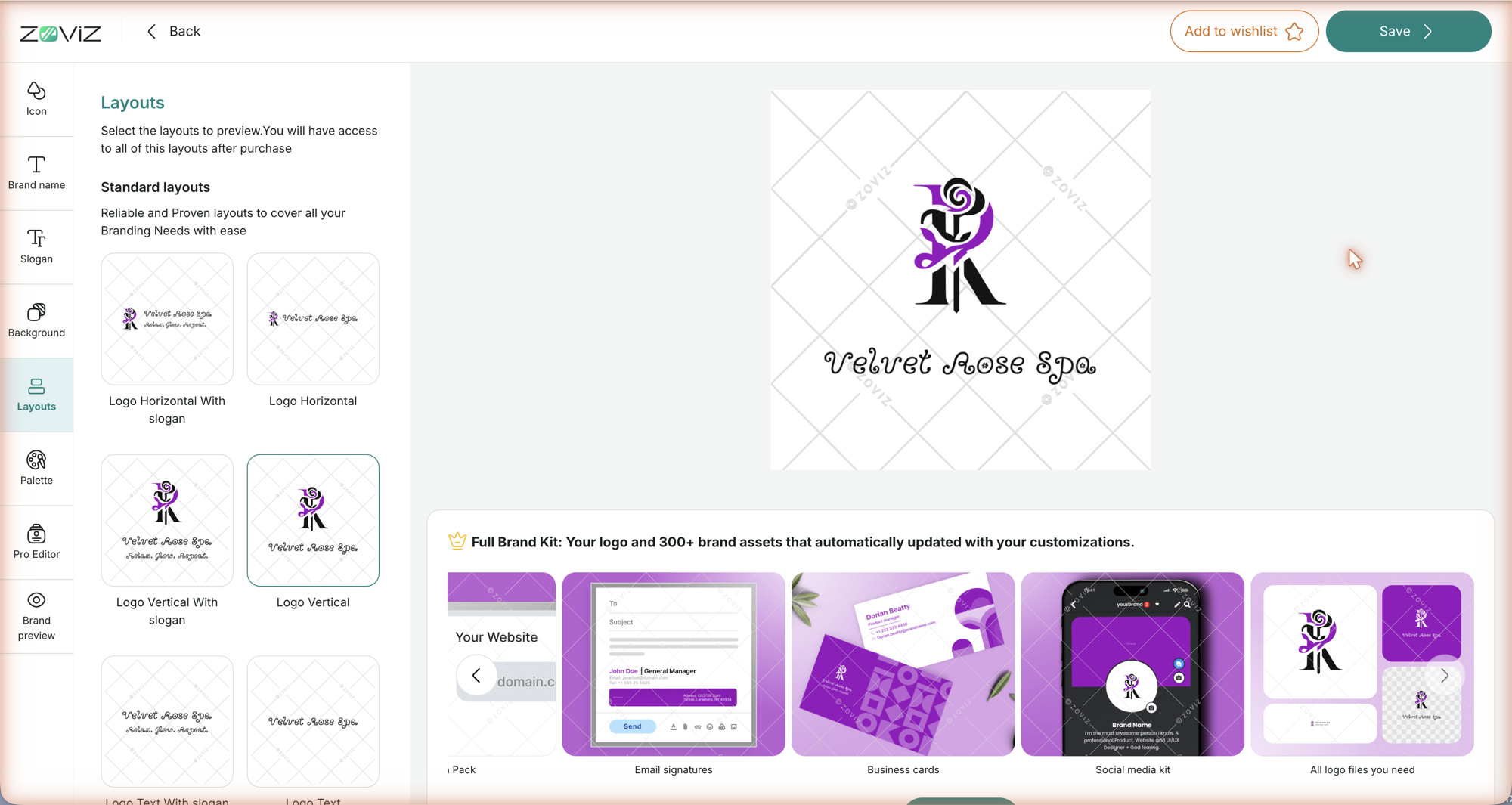
Seven Standard layouts cover the usual placements: Logo Horizontal, Logo Vertical, Logo Text, Logo icon, and Horizontal / Vertical / Text with slogan. Click one to preview your logo in it. Selecting a layout here is a preview — every standard layout is included in your logo files once the brand is unlocked (see Your logo files).
Palette
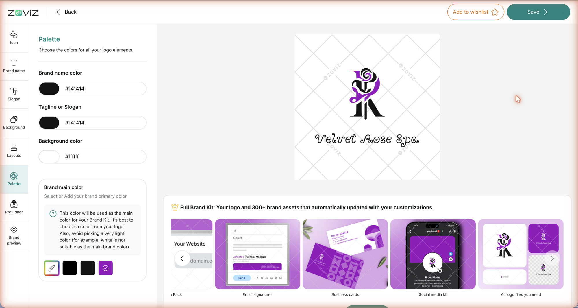
One place to set the text and background colors together — Brand name color, Tagline or Slogan, and Background color as hex values — plus Brand main color. (Icon colors stay in the Icon panel.) The main color is the one your whole Brand Kit is built around, so the panel's own advice applies: pick a color from your logo, and avoid very light colors — white is not suitable as the main brand color.
Pro Editor
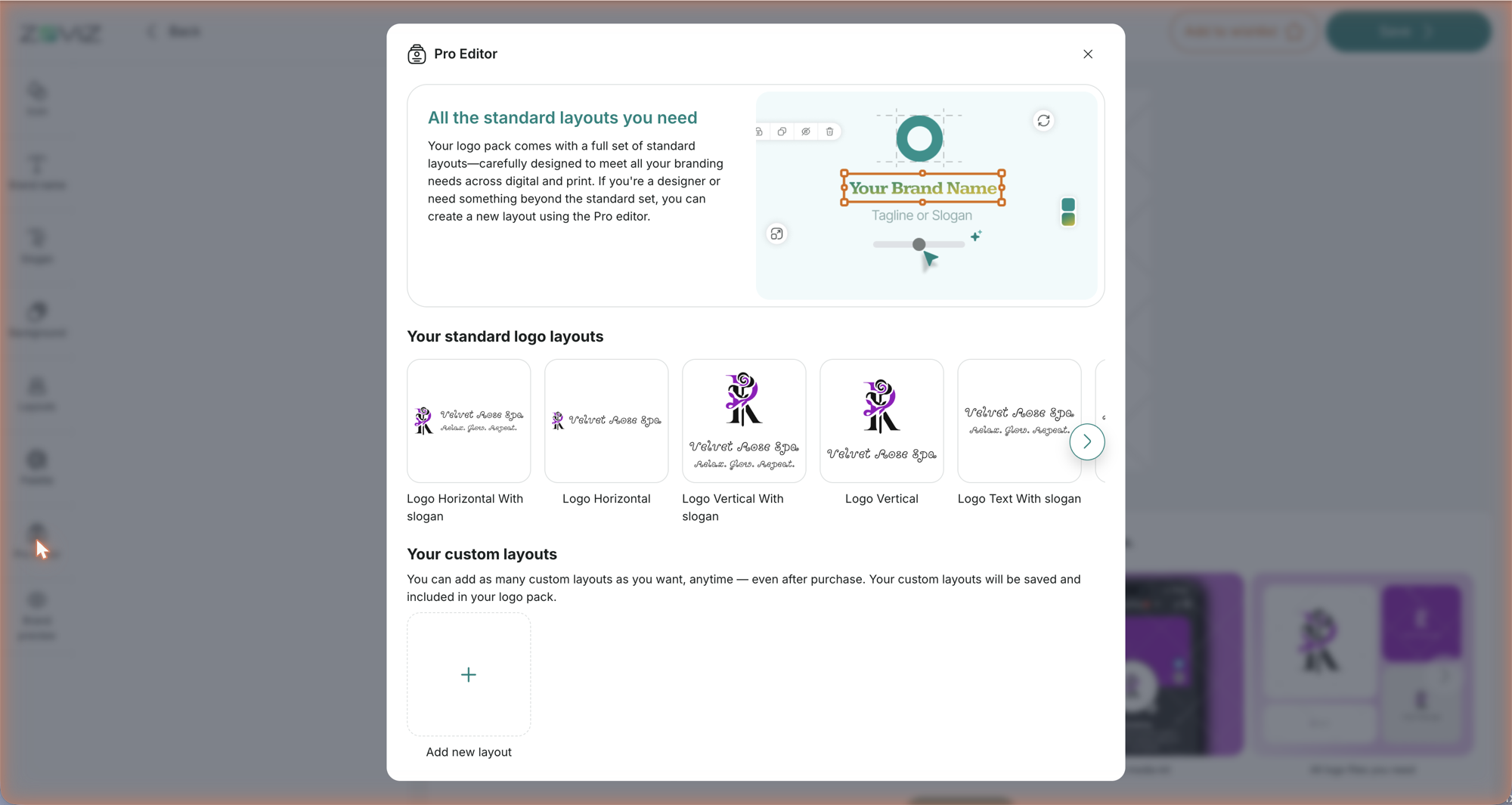
Pro Editor opens with an overview: your standard layouts, and Your custom layouts. You can add as many custom layouts as you want, any time — even after purchase — and they are saved and included in your logo pack. Add new layout opens the Pro editor itself.
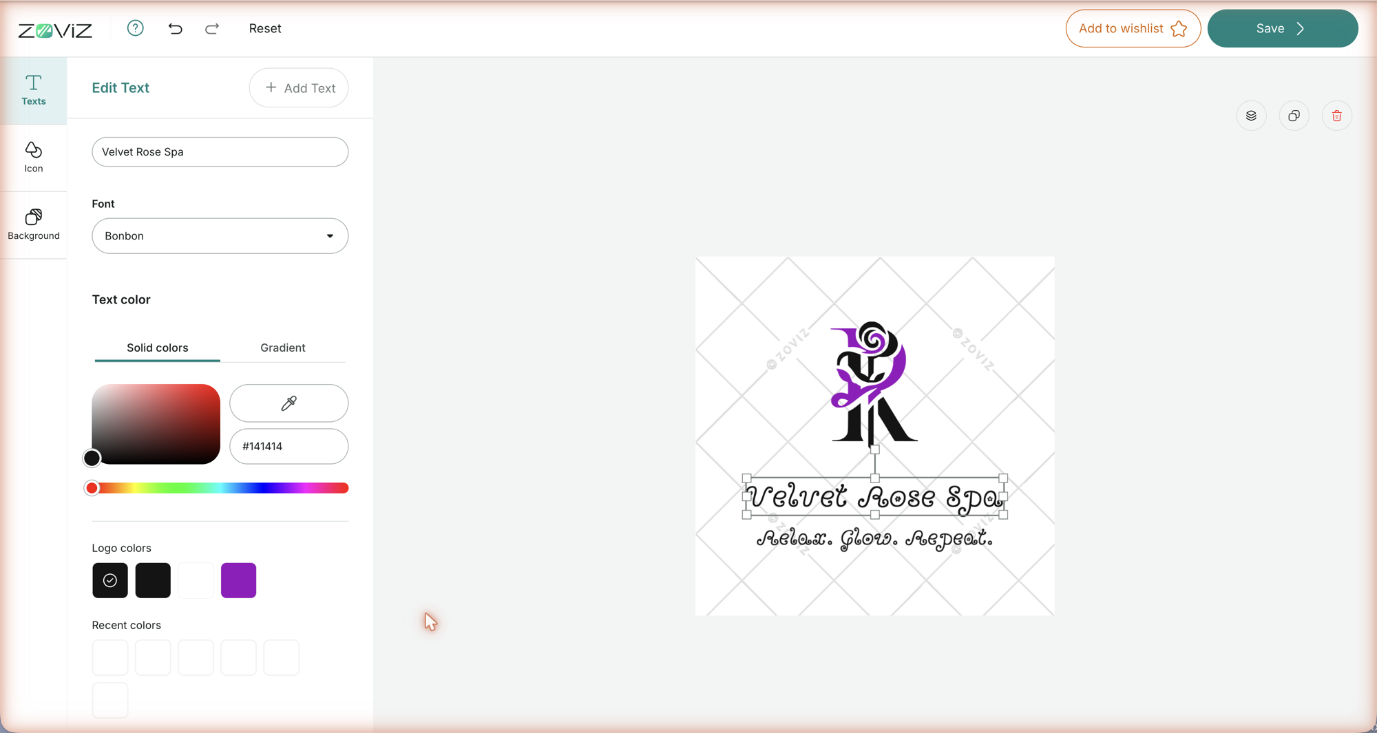
The Pro editor is free-form. Three panels — Texts, Icon, Background — let you Add Text or Add icon, edit each element's color (Solid, Gradient, or Multi-Color for icons) and, for text, its font, and set its Rotation and Size with sliders. On the canvas you drag, resize, and rotate elements directly; the three-icon toolbar at the top-right of the canvas handles layer order, duplicate, and delete. The top bar has a ? that reopens the intro, undo / redo, Reset, Add to wishlist, and Save.
Brand preview
The last panel isn't for editing — it shows your brand in action with the current logo and main color, and lists what the brand kit includes: all logo files (SVG, PNG, JPG, PDF), the social media kit, letterheads (Microsoft Word), business cards, email signatures, the favicon pack, and brand guidelines. Use it as a final check before you save.
Saving
Save applies the logo to your brand. Because every template in Zoviz is rendered from your brand, the Brand Kit picks up the new logo and colors — that's what the Full Brand Kit strip is previewing. Files you downloaded before the change don't update retroactively; download them again.
Tips & limits
- Two-tone icon? Use the Multi-Color tab — each part of the icon can be recolored on its own. Picking a color on the Solid tab flattens the whole icon to that one color.
- Set the main color deliberately. It drives every asset in the kit. A color from the logo works best, and never a very light one.
- Layouts vs. Pro Editor. Standard layouts are all included; reach for the Pro Editor only when you need an arrangement they don't cover.
- Not sure yet? Add to wishlist bookmarks this logo to your Wishlist so you can come back to it later.
- Changed your mind? Back discards unsaved edits after a confirmation; the Pro editor also has undo / redo and Reset.
Related
- The logo album — choosing the logo you'll edit
- Logo Maker — the whole flow, from name to download
- Your logo files — every color version, layout and download option
- Brand Dashboard tour — where Edit logo lives
- Using the design editor — the other editor, for templates and Brand Kit assets
Still stuck? Contact Zoviz support or ask Zoviz.